Centered or left-aligned text? How alignment affects online readability
Text alignment affects reading flow, scannability, and accessibility. Learn when centering works and why body text should usually be left-aligned.

Ask AI to summarize:
Text alignment can look like a minor visual choice. In practice, it affects how easily readers find the start of the next line, scan the content, and follow longer passages.
Left-aligned text is the safest default in left-to-right languages such as English. Centered text can work in headings, short callouts, and individual calls to action, but in longer paragraphs its uneven left edge makes each new line harder to find.
The short answer: If content is meant to be read, scanned, and understood, align body text to the left. Reserve centering for short, clearly defined elements.
Avoiding centered body text is an accessibility best practice, not a blanket WCAG rule.
Text alignment decision table
| Content type | Recommendation | Why |
|---|---|---|
| Article body text | Left-align | A consistent starting point and clear reading rhythm |
| Long introduction | Left-align | Several lines and a high information load |
| Short hero heading | Centering can work | Functions as a distinct, prominent message |
| Hero description | Usually left-align | Text wraps easily on mobile |
| Short CTA line | Centering can work | One clear action |
| Email body text | Left-align | Narrow mobile view and scannable structure |
| PDF report | Left-align | The document is intended to be read |
| Short quotation | Centering can work | A contained visual callout |
| Long quotation | Left-align | It effectively becomes body text |
| Error message | Depends on length | One sentence can work centered |
| Form instructions | Left-align | Users need to find the information quickly |
This table is practical design guidance. For example, the 2–3-line limit mentioned later is not a research-backed threshold or a WCAG requirement.
First, an important distinction
Two terms that are easy to confuse need to be separated.
Centered text places each line in the horizontal center. The starting point of each line changes according to its length.
Fully justified text creates a straight edge on both the left and right. The browser or word processor achieves this by changing the spacing between words or characters.
This distinction matters when interpreting the evidence. A 2007 study by Ling and van Schaik compared left-aligned and fully justified text. It did not directly compare centered and left-aligned text. The study can show that text layout affects visual search on web pages, but its findings should not be presented as a direct measurement of the effects of centered text.
How does alignment affect reading?
Readability
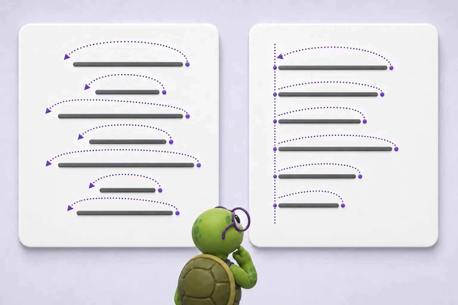
At the end of a line, the reader’s eyes must return to the beginning of the next one. In a left-aligned paragraph, that point is always in the same place and acts as a visual anchor.
In a centered paragraph, every line begins in a different place. The extra effort is almost unnoticeable for a single line break. In a long paragraph, however, the same small search is repeated dozens of times.
According to WebAIM’s guidance on typographical layout, left-aligned text is almost always the easiest option for left-to-right languages. The British Dyslexia Association also recommends left alignment without full justification, making line starts and endings easier to find while keeping word spacing consistent.
Scannability
People often scan digital content for headings, keywords, and the section that answers their question.
Left-aligned content creates a clear line for the eye to follow. If headings, introductions, and paragraphs are all centered, their starting points vary. This makes the page structure harder to understand at a glance.
Comprehension
A structure that is harder to follow can divert attention from the content. Based on this set of sources, however, it would be unjustified to claim that centered alignment alone always reduces reading comprehension.
A more precise conclusion is that multi-line centered text can make the next line harder to find and slow down reading. The effect is likely to increase with the amount of text, zoom level, and narrower viewports. This does not mean that every centered heading is difficult to understand.
What does the research say about text alignment?
Jonathan Ling and Paul van Schaik studied how line spacing and text alignment affect visual search on web pages. Wider line spacing improved accuracy and reduced reaction times. Left-aligned text produced better performance than fully justified text, even though participants preferred the appearance of the justified version.
The finding highlights a useful distinction:
Aesthetic preference does not always tell us how effectively content can be used.
Direct research comparing centered and left-aligned body text specifically in emails, websites, and PDF documents is limited. Alongside research, the practical recommendation is based on typographic principles and guidance from WebAIM, W3C, and other accessibility organizations. The claim that “centered text always reduces comprehension” would therefore be too absolute.
Mobile makes the problem visible
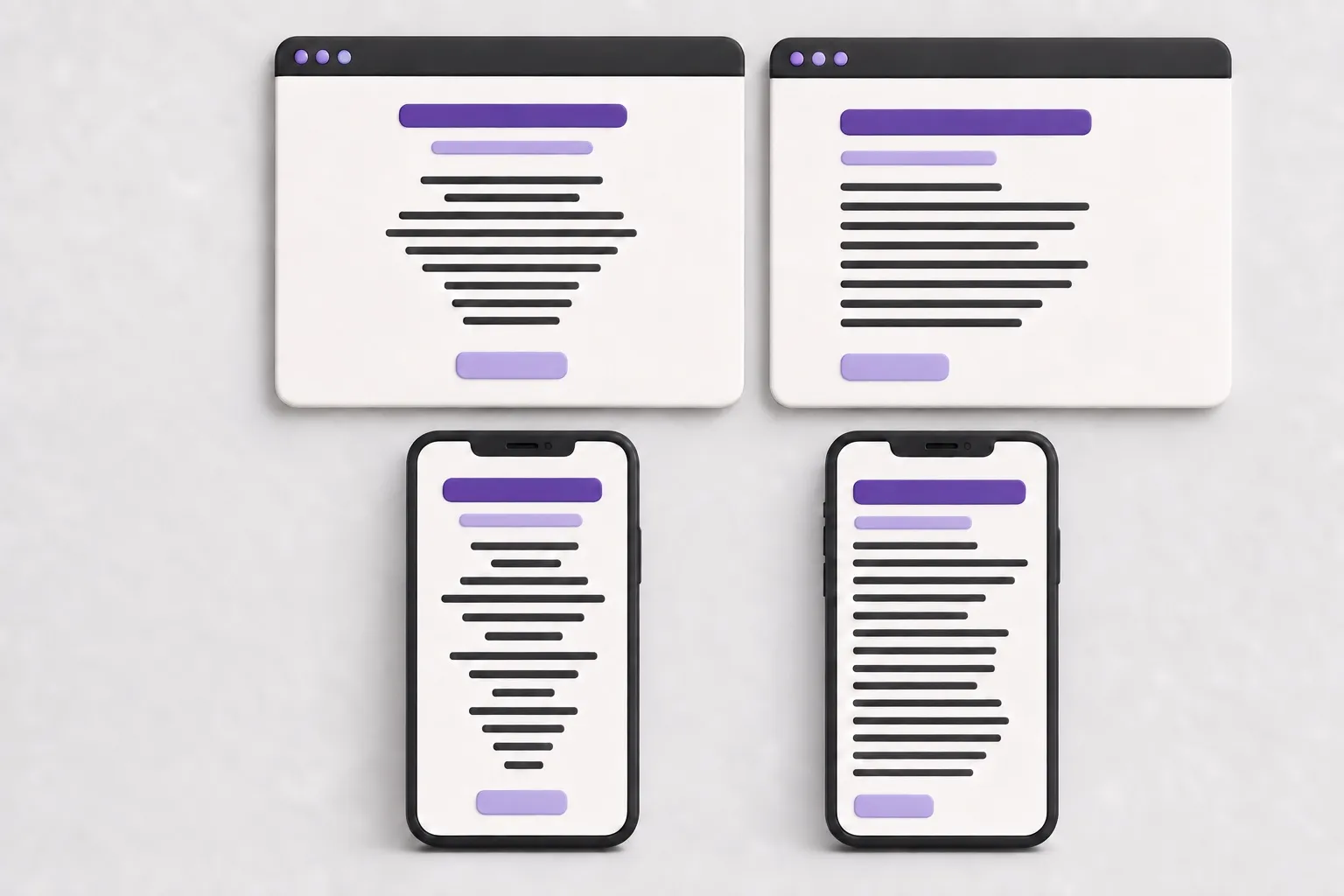
A centered introduction that takes up two lines on a desktop can wrap to six lines on a phone.
As the available space narrows, there are more lines and more irregular starting points. The text block becomes taller and slower to scan.
The same thing happens when a user enlarges the text. Alignment should not be approved based only on a wide desktop view.
The Level AA criteria in WCAG 2.2 require text to be resizable up to 200 percent without loss of content or functionality, and content to reflow into a narrow viewport without unnecessary two-dimensional scrolling. These requirements do not prohibit centering, but they make testing on mobile and at higher zoom levels essential.
Alignment across digital channels
Websites
On a website, centering can work as a visual device when the content is short and the element has one clear purpose.
Suitable uses can include a short hero heading, a one-sentence callout, a short quotation, a key figure, an individual CTA line, or a confirmation message. Body text, a long introduction, a service description, instructions, or an article paragraph should instead be left-aligned.
A good practical rule is to evaluate an element using its longest real content, not short placeholder copy. “Growth through data” may look flawless when centered. A five-sentence description of what growth through data means is a different animal. Unfortunately, that one has made it into production too.
Emails
Centering can work in a short email heading, an image-led header, and around a button. The message itself should be left-aligned: emails are often read in narrow viewports, where a long centered paragraph quickly wraps across many lines.
This is an application of general readability and accessibility principles, not a claim that every left-aligned email will generate more clicks. Alignment can make a message easier to use, but campaign performance also depends on the content, sender, offer, timing, and about twenty other factors—until someone eventually suggests testing the button color.
PDF documents
A PDF can be either a visual presentation or a document intended for reading. They should not be designed in the same way.
In a presentation, a single centered statement can work because the speaker provides the missing context. In a guide, report, or proposal, readers need to be able to move through the content without a speaker.
When a PDF is intended to be read, left-align the body text, keep paragraphs short, and use subheadings. Avoid overly long lines, and test the document at higher zoom levels and on a small screen.
The British Dyslexia Association’s guide applies the same principles for presenting text to emails, presentations, websites, and printed materials.
Accessibility and WCAG
WCAG 2.2 does not include a blanket prohibition on centered text. Level AAA Success Criterion 1.4.8 covers the visual presentation of text blocks and the ability to change it. It mentions fully justified text, not a general ban on centered text.
The W3C page Understanding Success Criterion 1.4.8 further explains that the content’s default presentation does not need to use all of the listed values. The requirement concerns a mechanism that allows users to achieve the specified presentation.
The precise conclusion is therefore:
Long centered text is not a WCAG failure in itself, but avoiding it is a well-founded accessibility and usability recommendation.
The W3C Low Vision Accessibility Task Force’s supplemental guidance also recommends avoiding centered alignment for text blocks longer than one sentence. This is useful practical guidance, not a standalone WCAG requirement.
That distinction is worth preserving. Otherwise, a good practice accidentally turns into an invented legal clause, and the meeting gains a new side plot.
When does centered text work?
Centering works best when the text is short, visually distinct, and intended to draw attention.
Suitable uses can include:
- a short hero heading
- a one-sentence callout
- an individual key figure
- a short quotation
- a confirmation message
- a short call to action
Centering becomes a risk when the element contains several sentences or wraps into a long zigzag in a narrow viewport.
A practical design system rule could be:
Centering may be used for an element that remains no more than 2–3 short lines at common viewport widths. Longer text is left-aligned.
The limit is not a magic number proven by research. Its value lies in consistency: the team does not have to solve the same question again in every component.
How to test text alignment
1. Use the longest realistic content
Short placeholder copy hides problems. Test the component with a heading or description that represents the longest content likely to appear in production.
2. Check the mobile view
See how many lines the text wraps across. If centered content forms a long, uneven edge, switch it to left alignment.
3. Enlarge text to 200 percent
Make sure the content remains readable, usable, and logically grouped.
4. Scan without reading
Try to find the headings, key points, and next action within a few seconds. If content blocks continually begin in different places, the structure may be unnecessarily restless.
5. Measure performance, not just preference
Ask a user to find a specific piece of information in the text. Observe the time taken and any errors. The question “Which one looks better?” measures visual preference, not usability on its own.
A recommendation for your design system
The safe default for digital services is simple:
Left-align all body text intended for reading. Allow centering only in short headings, callouts, and calls to action that remain short on mobile and with enlarged text.
This rule does not prevent visual expression. It separates content intended for emphasis from content intended for reading.
Summary
Left-aligned text is the best starting point for body copy in English-language digital services. A consistent left edge makes the next line easier to find and the content easier to scan.
Centered text works in short, distinct elements whose purpose is emphasis. Its effectiveness declines as the amount of text grows, especially on mobile or with enlarged text.
Centering can say: “Look at this.”
Left alignment says: “Read this.”
When content is intended to be read, the latter is usually the right choice.
Sources
- Peer-reviewed study: Ling, J. & van Schaik, P. (2007). The influence of line spacing and text alignment on visual search of web pages. Displays, 28(2), 60–67. The study examines the effects of left-aligned and fully justified text on visual search.
- WCAG standard: W3C. Web Content Accessibility Guidelines 2.2. Success Criteria 1.4.4, 1.4.8, and 1.4.10.
- W3C explanatory guidance: W3C. Understanding Success Criterion 1.4.8: Visual Presentation. An explanation of the Level AAA criterion for the visual presentation of text blocks.
- W3C educational resource: W3C Web Accessibility Initiative. Page Structure Tutorial. Guidance on clear structure and presentation for web content.
- Informative W3C task force guidance: Low Vision Accessibility Task Force. Supplemental Guidance: Text Justification. Supplemental guidance on centered and fully justified text; not a standalone WCAG requirement.
- Practical guidance from an accessibility organization: WebAIM. Text/Typographical Layout. Guidance on text alignment, line length, and white space.
- Accessibility organization style guide: British Dyslexia Association. Dyslexia Style Guide 2023. Recommendations for left alignment, line length, and document structure.
- Practical expert source: Bureau of Internet Accessibility. Why Justified (or Centered) Text is Bad for Accessibility. An interpretation of the accessibility effects of centered and fully justified text.
- Practical expert source: Traci Gardner. Centered Text Is Harder to Read. An illustration of the uneven left edge created by centered text.
Source: https://karppinen.one/blog/text-alignment-accessibility/
Issue breakdown
- WORDS
- 2,054
- Respectable amount of text.
- HEADINGS
- 23
- Loose structure.
- READ TIME
- 10 min
- You’ll survive.
- LINKS
- 13
- Paths to somewhere.
- CODE BLOCKS
- 0
- No terminal required.
- IMAGES
- 2
- Visual evidence included.